Experiments with Material Design
I’ve done a lot of UI changes with Helm lately based off this new design idea called Material Design. You should go check it out yourself, but the basic idea is you take flat UI design and organize it in layers like pieces of paper. The result is a combination of bold colors and skeuomorphic shadows.
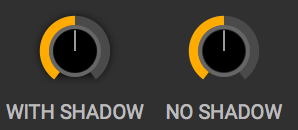
The shadows gave me pause, at first it felt like the 90’s again where you slap a drop shadow on everything. After looking through Google’s examples and applying many of their ideas to Helm, I have to say that I’m now a born-again drop shadow believer. They make colors really pop and are a great way to emphasize how important certain elements are.
Google’s design doc is pretty funny when they mention how to implement the shadows. They say you shouldn’t approximate the shadows with gradients or images. Instead they say, render the shadows with a 3d graphics engine. I guess I get it, when you have multiple layers overlapping the gradients won’t look right, but I don’t know many people who can hire a team of developers to develop a rendering engine just so the shadows look accurate!
After the shadows, the color section has been the most help in designing Helm. If you get overwhelmed with all the combinations of possible color palettes like I do, then using Google’s method for picking colors is a good place to start. They hit a good balance of restricting the colors enough so whatever combination you pick should look decent while also having enough colors and shades so not every app using this method will look the same.
If you care about design and want some guidelines to follow I highly recommend giving the whole Material Design doc a read. They hit on a lot of other topics like animation, layout and widgits that all have decent insight on what looks good and what doesn’t.