-
New Synth in the Works
-
Stickers!
I got some stickers printed of the new logo! If you PayPal me $5 at [email protected] and mention the stickers and include your address I’ll send you one :D

Since the synth is free this is a way of generating some (small) amount of monetary support.
I got these die cut stickers through Sticker Mule. They make super high quality vinyl stickers that are water/sun/scratch resistant. They can even go through the dishwasher.
Dimensions are about 3in x 3in.
-
Experiments with Material Design
I’ve done a lot of UI changes with Helm lately based off this new design idea called Material Design. You should go check it out yourself, but the basic idea is you take flat UI design and organize it in layers like pieces of paper. The result is a combination of bold colors and skeuomorphic shadows.
The shadows gave me pause, at first it felt like the 90’s again where you slap a drop shadow on everything. After looking through Google’s examples and applying many of their ideas to Helm, I have to say that I’m now a born-again drop shadow believer. They make colors really pop and are a great way to emphasize how important certain elements are.
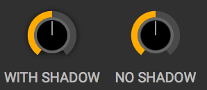

Google’s design doc is pretty funny when they mention how to implement the shadows. They say you shouldn’t approximate the shadows with gradients or images. Instead they say, render the shadows with a 3d graphics engine. I guess I get it, when you have multiple layers overlapping the gradients won’t look right, but I don’t know many people who can hire a team of developers to develop a rendering engine just so the shadows look accurate!
After the shadows, the color section has been the most help in designing Helm. If you get overwhelmed with all the combinations of possible color palettes like I do, then using Google’s method for picking colors is a good place to start. They hit a good balance of restricting the colors enough so whatever combination you pick should look decent while also having enough colors and shades so not every app using this method will look the same.
If you care about design and want some guidelines to follow I highly recommend giving the whole Material Design doc a read. They hit on a lot of other topics like animation, layout and widgits that all have decent insight on what looks good and what doesn’t.
-
Rebranding - Helm
I’m rebranding Twytch! First the name: Twytch was a little too similar to the video streaming service ‘Twitch’ and so after playing around with some logos and names I’ve decided on ‘Helm’. It conveys control, a common theme in synthesizers, it’s short and easy to remember, and I can’t find other software that uses the name except for an emacs plugin.
The other part is a new icon/logo. Graphic design is something I spend a lot of time on but doesn’t come natural to me. After many hours I think I have a logo I’m happy with. Here’s the development in reverse chronological order.
I think it’s more cute than cool and I’m good with that:

Got to ‘helmet’ stage, but didn’t like the shadows and square nose:

Flipped it, it’s almost a helmet and less of a plug:

I like the cuts of the yellow circle being align with the blue circle:

Getting away from that phallic design:

Trying a different flat, bold, outline style:

First design, it’s supposed to be a plug. Pretty phallic though:

-
Unexpected Optimization #2: fixed point arithmetic
I’ve wanted to add a ‘unison’ feature to Twytch for a while but without a significant performance hit. Unison works by having many oscillators per voice so improving the oscillator CPU usage was a must.
The way many oscillator implementations work is by having a ‘phasor’ which is a phase value that cycles through the values from 0 to 1. When the phase value is 0, we are at the beginning of the waveform, 0.5 we’re half way through and when we get to 1, we’re at the end and we set the value back to 0. Checking if we have to wrap the phase every sample for every oscillator can get pretty costly. One way to improve this is by using the modf function instead of a comparison and an if/else branch but it still is has a relatively large CPU hit.
int table_size = 2048;
double phase = 0.0;
double phase_diff = ...; // Usually we don't know what value this is.

for (int i = 0; i < samples; ++i) {
  phase += phase_diff;
  if (phase >= 1.0)
    phase -= 1.0;

  // Lookup value with phase. No interpolation for this example.
  int index = phase * table_size;
  output_buffer[i] = lookup[index];
}

// Alternatively with modf which is slightly more efficient.
double integral_part = 0.0;
for (int i = 0; i < samples; ++i) {
  phase = modf(phase + phase_diff, &integral_part);

  // Lookup value with phase. No interpolation for this example.
  int index = phase * table_size;
  output_buffer[i] = lookup[index];
}
There’s another solution though and it’s using ‘fixed-point’ instead of ‘floating-point’ numbers. Floating point numbers can represent a crazy large range of numbers but for our phasor implementation we only care about number between 0 and 1. What we can do is use an unsigned integer type to represent these values. 0 will still remain the beginning of our waveform, but UINT_MAX will represent the end of our waveform. Cool thing about integers is that when we add to our phase and go past UINT_MAX, we get the wrapping for free! Another benefit is if our wave lookup table is a power of two, we can get the lookup index by bit shifting our current phase down which is another (albeit small) performance improvement.
int table_bits = 11;
int shift = 8 * sizeof(int) - table_bits;
int phase = 0;
int phase_diff = ...; // Usually we don't know what value this is.

for (int i = 0; i < samples; ++i) {
  // Automatially wraps :D
  phase += phase_diff;

  // One bit shift is more efficient than a multiply and cast I believe.
  int index = phase >> shift;
  output_buffer[i] = lookup[index];
}
After this improvement I’m would say the DSP is at a releasable efficiency. Comparing Twytch to other similar synths on the commercial market, it’s in the middle of the pack. The next thing I’ll be focusing on is improving the UI efficiency as there are a lot of moving parts in Twytch and most of them are not CPU friendly.
-
Long Update
Whew, it’s been a while and a lot has changed! I’ve decided to make Twytch a free and open source project releasing it under GNU. My new goal is to make a very accessible free synth that runs on most platforms. Because of this I’ve cut back a lot of the more experimental features like glitches in place of more established ones like unison and a powerful modulation system.
The new modulation system is heavily inspired by Bitwig Studio though I don’t think they were the original creators of this type of system. I’ll talk more about how it works in a different post.
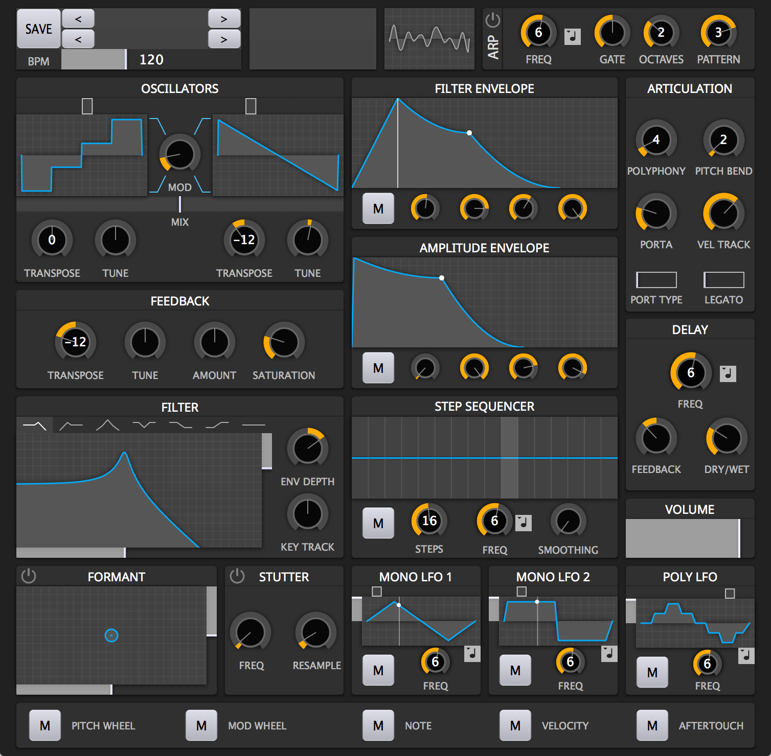
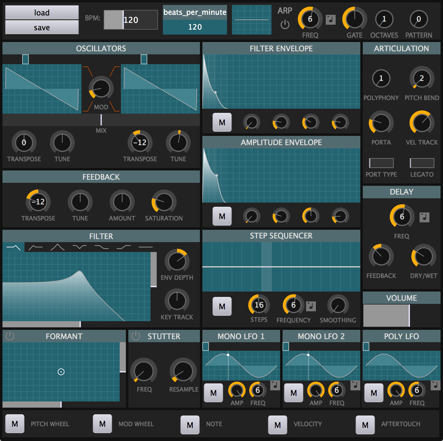
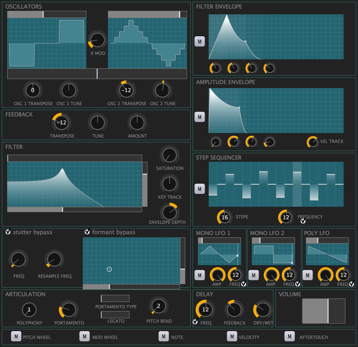
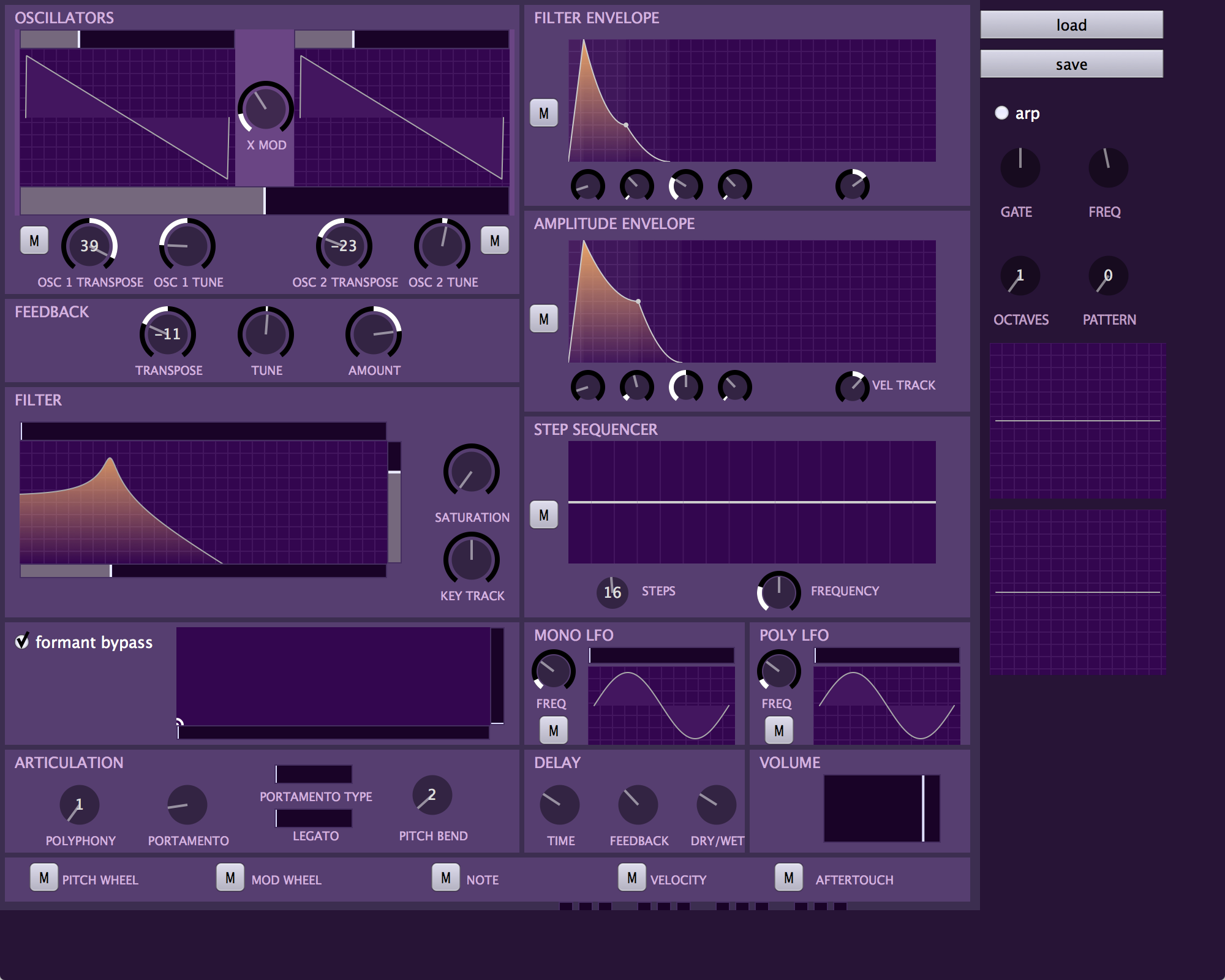
I’ve made a bunch of changes to the UI and there’s a lot more coming! I find going back through the iterations entertaining so I’m posting them all here. The most recent changes are inspired by Material Design which has heavy shadow usage. I used to think drop shadows were pretty outdated, but when combined with a flat UI, it looks really fresh.
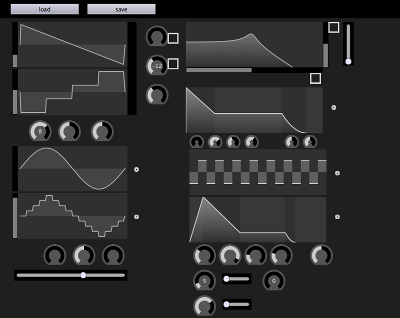
Here are the UI screenshots in reverse chronological order:
Material design attempt 1 and new colors. Look at dem shadows:
No more borders:
Trying out some new colors:
I’m not sure if I want this entire synth to be purple:
Prototyping widgits:
-
Unexpected Optimization #1: avoiding denormals
I’ve been noticing a strange spike in CPU usage while playing with Twytch. When a synth voice rings out and is not producing sound anymore, it is killed and reused later to save CPU cycles. However, there’s a significant increase in CPU usage right before a voice dies. For a while this was a mystery, but I was recently reading some filter code in another project that added a very small alternating current to the input of the filter. In the comment it said “Hack to prevent denormals”.
A denormal is a type of really small floating point number. Wikipedia give a better explanation, but in short the structure of floating point numbers cause the gap from 0 to the smallest positive number to be much larger than the gap between the two smallest positive numbers. Architectures compensate for this by setting aside some numbers that are more evenly spaced really close to zero called “denormal numbers” or “subnormal numbers”. The problem with this in synth development, is that processing subnormal numbers is much slower than normal floating point numbers. Since we create really small numbers any time there’s an exponential decay like in an envelope or a filter, we need to disable denormals.
The alternative to having denormals is flushing those numbers to zero. Since these numbers are so small these jumps are imperceptible in an audio signal. All we have to do is slap an environment variable setting and we should be good to go! (on some machines)
#include <fenv.h> // ... fesetenv(FE_DFL_DISABLE_SSE_DENORMS_ENV); -
Unexpected Optimization #0: at() vs operator[]
Writing a soft synth requires a lot of optimization. As I develop twytch and the synth engine it’s built on, mopo, I’ll be posting many of the optimizations I make, especially nonobvious ones. These could range from simple things like using one-multiply instead of two-multiply interpolation:
// These lines compute the same value.
double one_multiply = from + t * (to - from);  // 1 multiply and 2 adds
double two_multiply = t * to + (1 - t) * from; // 2 multiplies and 2 adds
Or could be uglier solutions like embedding assembly instructions in C++. I’m not a C++ optimization expert yet, so some of these things may be more obvious than others.
This first unexpected optimization concerns accessing values from std::vector. Consider these two methods of element access:
std::vector<double> vect = ...;
double one = vect[0];
double two = vect.at(0);
There is a significant difference between the two: at() does boundary checking while operator[] does not. You don’t normally notice this performance difference, but I was running it once per audio sample for every single component which totaled in the millions per second.
Now why would I use at() instead of operator[] in the first place? The way mopo sets up polyphony is that all the module instances in each voice share a list of input pointers. For example, every Filter instance in each poice has a pointer to the same std::vector. Using at() on a pointer to std::vector is much easier to read than using operator[] or dereferencing first so I first chose the slower but prettier method.
std::vector<double>* pvect = new std::vector<double>();
pvect->push_back(1.0);

double slow = pvect->at(0);          // easy to read but slow.
double fast1 = pvect->operator[](0); // fast ugly access 1
double fast2 = (*pvect)[0];          // fast ugly access 2
Fortunately switching from at() to operator[] an easy thing to fix, and I got a significant 25% speed boost because of it.
-
Starting Development on Twytch, an open source synthesizer
On the 1st day of 2015, I started development on an open source software synth, Twytch. I’ve decided to keep a devblog after seeing some of the devblog successes in the indie game development world such as Willy Chyr’s Relativity and Phosfiend Systems’ Fract OSC.
The goal of Twytch is a mix of granular and subtractive synthesis that focuses on glitching live and sampled audio input. It currently runs as a VST and Audio Unit and hopefully will run as a stand-alone synthesizer in the future. Some of the technologies I’m using are:
- JUCE: for cross platform UI development and VST/AU input and output handling
- mopo: a modular and polyphonic synthesizer engine I’m working on
I started with the code from a past synthesizer I made called cursynth. It’s this goofy stand-alone ascii synth that runs inside of a terminal with ascii sliders and graphics. From the past weeks of work I have a functioning Audio Unit synthesizer and the beginnings of many of the UI elements. There’s also very cumbersome patch saving and loading, but it works. I’m now at that point in development where you just throw all the controls on the screen and make an ugly UI soup. Have a look:

subscribe via RSS